Ever switched your phone to “grayscale mode” or heard someone say, “This photo looks great in grayscale” — and wondered what that actually means? 🤔
The term grayscale is used widely in photography, graphic design, and digital displays, but it’s often misunderstood. Simply put, grayscale refers to images composed only of shades of gray — from black to white — without any color.
In this article, we’ll cover:
✅ What grayscale means
📜 Its origin and evolution
💻 How it’s used across different platforms
🖼️ Real-life examples of grayscale images
⚙️ Related terms and FAQs you should know
🎯 What Does Grayscale Mean?
Grayscale means an image or visual that consists of varying shades of gray, ranging from pure black to pure white, with no other colors present.
It’s not slang — it’s a technical term used in digital design, photography, and display technology to describe colorless visual representation based on light intensity.
Example:
“This portrait looks more dramatic in grayscale.”
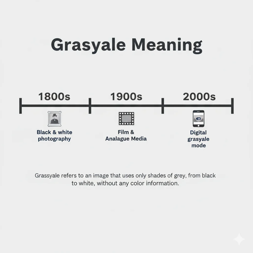
🕰️ Origin and Popularity
The concept of grayscale dates back to the early days of photography in the 19th century, when cameras could only capture images in black and white.
The word “grayscale” itself combines ‘gray’ (the color) and ‘scale’ (range or measure), meaning a scale of gray tones.
With the rise of computers in the 20th century, grayscale became a key term in digital imaging and display technology, referring to how brightness levels are represented on screens and printers.
By the 2000s, it became common in design tools like Photoshop, GIMP, and mobile phone settings, even as a feature to reduce screen addiction or improve focus.
💡 Grayscale Meaning in Different Contexts
Let’s see how grayscale is used across various fields and digital platforms:
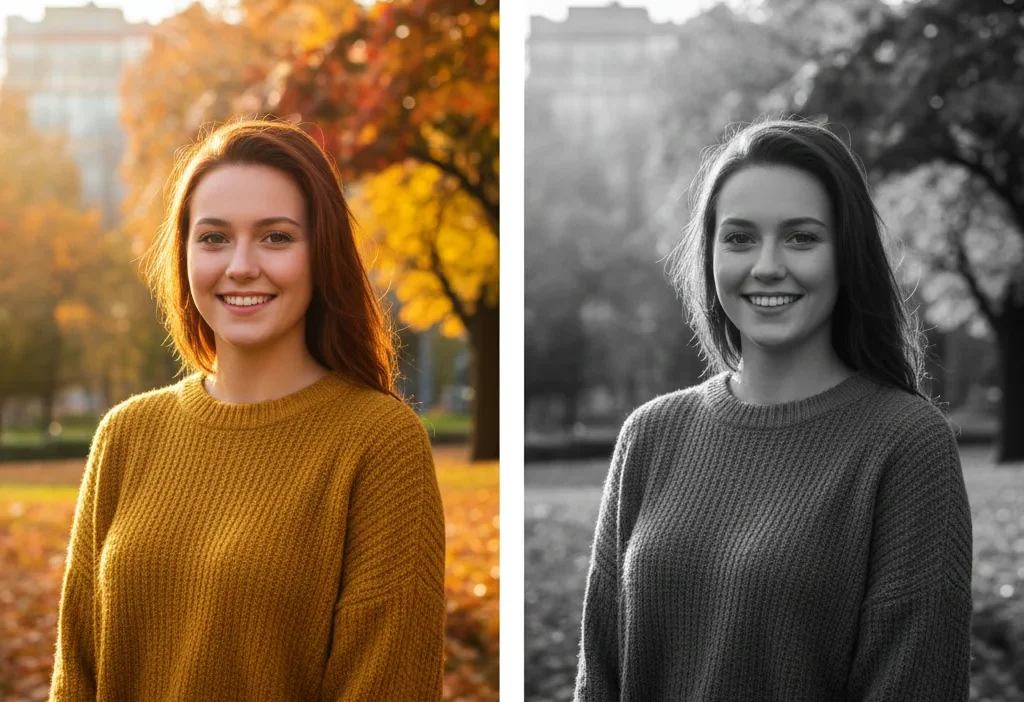
🖼️ In Photography & Art
- Grayscale images highlight contrast, texture, and light without color distractions.
- Artists and photographers use it to emphasize emotion, form, and composition.
“The grayscale filter brought out the emotion in her expression.”
💻 In Digital Design
- In software and UI design, grayscale helps designers focus on layout balance and usability before adding color.
“We created a grayscale wireframe to test visual hierarchy.”
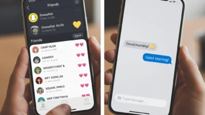
📱 On Mobile Devices
- Grayscale mode on smartphones removes color to reduce screen time or digital addiction.
“I turned my phone grayscale to stop mindless scrolling.”
🖨️ In Printing and Scanning
- Printers use grayscale to simulate color using black ink in varying densities.
“Please print this document in grayscale to save color ink.”
| Context | Meaning of Grayscale | Purpose |
| Photography | Black-and-white imagery | Artistic depth |
| Digital Design | Gray-tone layouts | Visual testing |
| Mobile Phones | No-color screen mode | Focus & minimalism |
| Printing | Shades of black ink | Cost efficiency |
💬 Examples of ‘Grayscale’ in Conversations
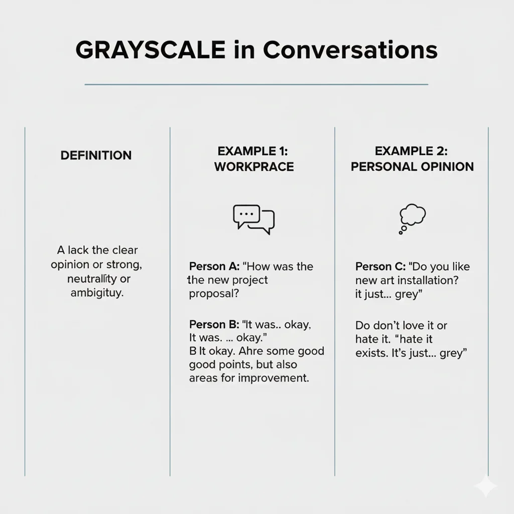
Example 1 (Photography):
Friend 1: Why’d you make the photo black and white?
Friend 2: It’s not just black and white — it’s in grayscale for a softer look.
Example 2 (Tech):
Designer: Let’s keep the prototype in grayscale until we finalize the color palette.
Example 3 (Lifestyle):
User: I switched my phone to grayscale, and it’s amazing how less addictive it feels! 📵
Example 4 (Formal):
“The grayscale version of the logo maintains clarity when printed without color.”
🔍 Similar or Related Terms
| Term | Meaning | Difference from Grayscale |
| Black and White | Image with only black and white, no intermediate grays | Grayscale includes many shades between black and white |
| Monochrome | Image in a single color hue | Grayscale is a type of monochrome using gray tones |
| Desaturated | Color image with reduced saturation | Still contains faint color, unlike grayscale |
| Contrast | Difference between light and dark areas | Affects tone, not color |
🧠 How to Use ‘Grayscale’ Correctly
✅ Do’s:
- Use “grayscale” for images or designs without color.
- Apply it when discussing visual tone, lighting, or display quality.
- Perfect for art critiques, design discussions, or technical explanations.
❌ Don’ts:
- Don’t use it as a synonym for “boring” — it’s a technical and artistic term.
- Don’t confuse it with “monotone” — grayscale refers specifically to gray tones.
Correct Usage Examples:
✅ “Convert the image to grayscale for a timeless effect.”
❌ “That presentation felt grayscale.” (Incorrect context)
⚠️ Common Mistakes or Misinterpretations
- Mistake 1: Thinking grayscale = black and white.
→ Grayscale includes many shades of gray, not just black and white. - Mistake 2: Using “grayscale” to describe something dull.
→ It’s not a mood word; it’s a visual and design concept. - Mistake 3: Assuming it’s only for photography.
→ It’s also used in printing, tech, and accessibility design.
❓ FAQ Section
1. What does ‘grayscale’ mean in photography?
It refers to a black-and-white image containing multiple shades of gray between pure black and white, used to emphasize texture and contrast.
2. Is grayscale the same as black and white?
Not exactly. Black and white images only use two colors, while grayscale images include 256 shades of gray for smoother transitions.
3. What is grayscale mode on phones?
It’s a feature that removes color from the display, helping reduce distractions and make devices less visually stimulating.
4. Is grayscale a color?
Technically, no. It represents light intensity, not color hue.
5. When should designers use grayscale?
Designers use it during early design stages or wireframing to test balance and readability before applying color schemes.
6. Can grayscale save ink when printing?
Yes, printing in grayscale uses only black ink, which helps reduce color cartridge usage and costs.
🏁 Conclusion
To sum it up, grayscale means an image or display made up of shades of gray, without any color. 🎨
Originating from early photography, it remains vital in digital design, printing, and technology for its clarity and emotional depth.
Whether you’re editing photos, creating user interfaces, or reducing screen time — grayscale helps simplify visuals while enhancing focus and tone.
Now that you know what grayscale meaning truly is, you’ll see it everywhere — from classic portraits to your phone settings!

Deborah Levy is a word-meaning expert at Meanovia.com. She explains complex terms, phrases, and language trends in a clear, relatable way, helping readers quickly understand the exact meaning behind every word.